|
Products | Support | Email a link to this topic. | Send comments on this topic. | Back to Introduction | Help Version 19.0.4.3
|

|
Products | Support | Email a link to this topic. | Send comments on this topic. | Back to Introduction | Help Version 19.0.4.3
|
The ImageViewer class uses the standard Margins, Borders and Padding system (The CSS Box Model) to construct the layout and render the view and items.
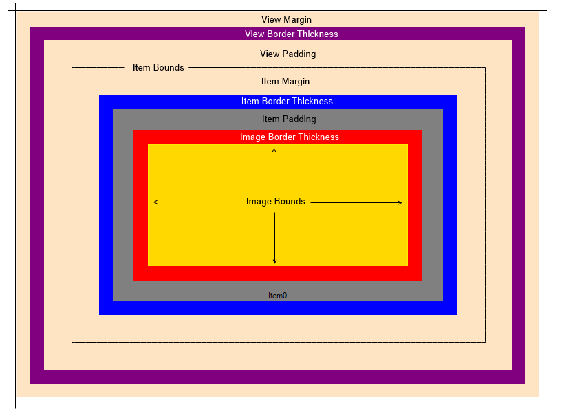
The following illustration describes the concept:

The view is the area of all the items plus the value of the view border and padding.
The content of each item is the area inside its border (The gray area in the illustration).
Here is the image viewer layout starting from the outmost:
Note: The following layout assumes that the image viewer is not using Elements Mode.
| Property | Type | Description |
|---|---|---|
| ImageViewer.ViewMargin | ControlPadding |
Area between the top left of the viewer client rectangle and the view border. |
| ImageViewer.ViewBorderThickness | Integer |
Thickness of the view border |
| ImageViewer.ViewPadding | ControlPadding |
Area between the view border and the item |
| ImageViewer.ItemMargin | ControlPadding |
Area between the top left of the item and the view padding |
| ImageViewer.ItemBorderThickness | Integer |
Thickness of the item rectangle |
| ImageViewer.ItemPadding | ControlPadding |
Area between the item border and the image |
| ImageViewer.ImageBorderThickness | Integer |
Thickness of the image border |
| ImageViewer.ItemSpacing | LeadSizeD |
Spacing between adjacent items. Only used if there are more than one visible item in the layout |
Note that all the values above are in pixels and are fixed regardless of the current zoom value.
The following table shows how each area is rendered.
Note: The following layout assumes that the image viewer is not using Elements Mode.
| Property | Description |
|---|---|
| ImageViewer.ViewMargin |
Control background color |
| ImageViewer.ViewBorderThickness | |
| ImageViewer.ViewPadding |
Control background color |
| ImageViewer.ItemMargin |
Control background color |
| ImageViewer.ItemBorderThickness |
ImageViewer.ItemBorderColor, ImageViewer.SelectedItemBorderColor, ImageViewer.HoveredItemBorderColor or ImageViewer.ActiveItemBorderColor depending on the item state. |
| ImageViewer.ItemPadding |
ImageViewer.ItemBackgroundColor, ImageViewer.SelectedItemBackgroundColor, ImageViewer.HoveredItemBackgroundColor or ImageViewer.ActiveItemBackgroundColor depending on the item state. |
| ImageViewer.ImageBorderThickness |
The view is the area for all of the elements listed in the table above accept ImageViewer.ViewMargin:

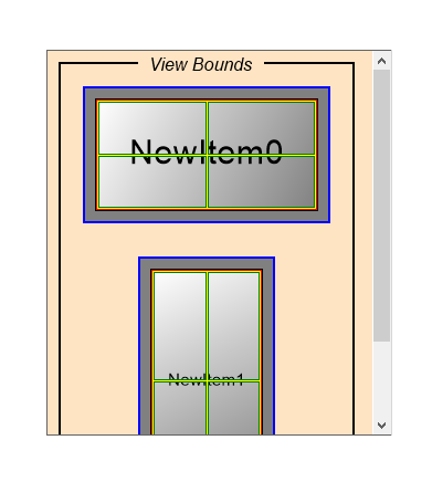
ImageViewer with padding and margins set and two items. Using a vertical view layout.
ImageViewer uses the view size to calculate the values of the scrollbars. The total size in pixels calculated by the layout system can be obtained through the read-only ImageViewer.ViewSize property. The bounding rectangle (starting position is client area plus the view margin) can be obtained using the read-only ImageViewer.ViewBounds property. These two values are calculated based on the total layout size plus the current view transformation.
The view can be transformed using any of the following:
By using the scrollbars, updating the ScrollOffset property or using ScrollBy or ScrollByRestrict
Zooming the view in and out using the Zoom method
Rotating the view using the RotateAngle property
Flipping the view vertically using the Flip property
Mirroring the view horizontally using the Reverse property
All these operations will re-calculate the view (ViewSize and ViewBounds) and update the scrolling area.
The view can be aligned inside the view using ViewHorizontalAlignment and ViewVerticalAlignment.
The ViewDropShadow property can be used to render a drop shadow around the view bounds.

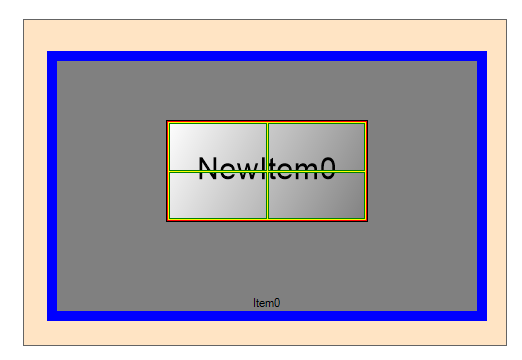
ItemMargin: This is the area outside the item (outside the blue border)
ItemBorderThickness: The blue area
Item Content: Gray area
ItemPadding: Area between the content (inside the border) and the image
Each item has a size, this can either be fixed for all the items in the viewer using the ImageViewer.ItemSize property (when the image viewer is used as an image list for instance). Or each item can have its own item size (ImageViewerItem.Size) that can be either set to a fixed value or calculated automatically by the viewer when an image is set in the item.
The item can be aligned inside the view using ItemHorizontalAlignment and ItemVerticalAlignment.
Inside each item is the content area. This is where the image data and the optional text will be rendered. The image is aligned inside the content using ImageHorizontalAlignment and ImageVerticalAlignment. These values changes the image alignment for all items in the viewer, to set an individual item use image alignment ImageViewerItem.ImageHorizontalAlignment and ImageViewerItem.ImageVerticalAlignment.
If the item contains a text string in the ImageViewerItem.Text property, then the image viewer will render this text using ItemTextFont and ItemTextColor (or SelectedItemTextColor if the item is selected). ItemTextTrimming and ItemTextWrap can optionally be used to control how the text is rendered if its size exceeds the bounding box. TextHorizontalAlignment and TextVerticalAlignment can be used to align the text inside the content. Similar to the image alignment above, to set an individual item text alignment use ImageViewerItem.TextHorizontalAlignment and ImageViewerItem.TextVerticalAlignment.
The ImageViewerItemPart enumeration can be used in methods and properties to donate the part of the item we are interested in.
The ImageDropShadow property can be used to render a drop shadow around the image bounds inside the content.
The image supports rendering a drop shadow around the view or around each item image using the following:
| Member | Description |
|---|---|
| ViewDropShadow |
The drop shadow property of the view. Will be rendered outside the view border and inside the view margin. Hence, you must ensure that the view margin value is big enough to cover the desired drop shadow size. |
| ImageDropShadow |
The drop shadow property of the item images. Will be rendered outside the image border and inside the item padding. Hence, you must ensure that the item padding value is big enough to cover the desired drop shadow size. |
Each of these properties is of type ControlDropShadowOptions and has the following members:
| Member | Description |
|---|---|
| IsVisible |
Visible of the drop shadow. If this value is not true then the drop shadow will not be rendered |
| Color |
The color of the drop shadow |
| OffsetX |
The position f the horizontal shadow |
| OffsetY |
The position of the vertical shadow |
| Blur |
The blur distance |
Using ImageViewer
Using Image Viewer with HTML5 and JavaScript
Image Viewer Components
Image Viewer Elements Mode
Image Viewer User Defined HTML Display
Using Multiple Image Viewers In Your Application
Image Viewer Items
Image Viewer Bounds and Transform
Image Viewer Transformation
Image Viewer Layouts
Image Viewer Rendering
Image Viewer Scrolling
Image Viewer Interactive Modes
Image Viewer Other Operations
Image Viewer Single Item Mode
Image Viewer Drag and Drop
Image Viewer Interpolation